Microsoft's Magnification Mystery
Mmm, alliteration. We start off this blog with an compelling conundrum concerning UI design, to which the answer is... almost as interesting.
Linear and non-linear sliders
As far as graphical user interface (GUI) elements are concerned, sliders have to be one of the most beautifully designed means of data input ever.
From a programmatic standpoint, implementing sliders involves very few lines of HTML code. It inherently constrains the type and range of data that can be inputted, keeping the amount of data validation required to a minimum. Its versatile nature also means that it can be used for pretty much any form of data entry where numerical input from the user is needed.
From the user’s perspective, the slider’s straightforward and intuitive design makes it incredibly easy to both understand and use. Instead of having to manually type in a number, users can simply drag the handle to a position that corresponds to the desired value.
Part of what makes the slider so intuitively simple to use is its linearity. Suppose we denote the position of the handle as \(x\) and the corresponding displayed value as \(y\). We limit the range of \(x\) to the closed interval between 0 and 1 (i.e. \(0 \leq x \leq 1\)). When \(x = 0\), the handle is positioned all the way to the left; when \(x = 1\), the handle is placed all the way to the right. Using these variables, we can treat the slider as a mathematical function — the slider shown above, for instance, is described by the linear equation \(y = 100x\).
To see why this linearity is so crucial, I’ve created another slider which like the one above ranges from 0 to 100, but has a non-linear relationship between \(x\) and \(y\).
Right away you’ll immediately notice a couple of flaws with this slider:
- To set the output value to 50, the handle must be dragged to a position that is noticeably off-centre, even though 50 is supposed to be midway between 0 and 100.
- The distance by which the handle must be dragged to increase the output value from 0 to 1 is significantly greater than that from 99 to 100, despite the absolute difference being identical in both scenarios.
This is perhaps not too surprising when I reveal that this wonky slider is in fact implemented using the function \(y = 100x^2\), which is quadratic rather than linear. Computing the derivative of \(y\) with respect to \(x\) gives \(y' = 200x\), which provides a neat explanation for the second flaw.
So there you have it: Unless you want users to pull their hair out trying to fill out a questionnaire, sliders should always be designed in a linear fashion.
…but there are exceptions.
The Zoom slider
I was using Microsoft Word the other day, when I realized something pretty interesting. Unfortunately, this was one of those discoveries that’s intriguing enough for me to get excited about, but not quite fascinating enough to bring up in everyday conversations (which is partly why I decided to write about it here).
Anyway, my micro-discovery concerns the tiny little slider at the bottom right corner of the Microsoft Word interface, shown below in Focus mode.
As you probably know, this slider is also featured in many other software applications included in the Microsoft Office suite, and is used to zoom in and out of the currently displayed document. What caught my eye though, is the fact that this slider has a minimum value of 10% and a maximum value of 500%, and yet when you drag the handle to the exact middle of the slider, you get a magnification of 100%.
| Position of handle \(x\) | Output value \(y\) (%) |
|---|---|
| 0.0 | 10 |
| 0.5 | 100 |
| 1.0 | 500 |
On the number line, 100% is nowhere near the midpoint between 10% and 500%, which means this magnification slider is — you guessed it — non-linear.
But non-linear how? After all, there are infinitely many ways for us to draw a strictly increasing curve that connects these three data points. This Stack Overflow answer, for example, outlines a method for finding an exponential function \(y = a + b \cdot e^{cx}\) whose graph passes through any three given points. The same exponential approach is echoed by responses like this one and this one.
So maybe the same is done in Microsoft Office? We can’t be sure — the only way to gather more information as to what this curve looks like is by sampling more data points. To do this, I can either
- spend hours dragging the slider handle around, estimating the approximate \(x\) value and recording the corresponding value of \(y\); or
- automate it with a program.
For the sake of accuracy, efficiency and fun, I went with the latter.
Collecting more data points
Here’s a brief outline of what I wanted the program to do. (Prior to program execution, I created a new document in Microsoft Word and dragged the slider handle all the way to left, with a magnification of 10%.)
- Initialize the variable
current_zoomand set its value to 10. This variable will keep track of the value currently displayed by the Zoom slider (in %). - Take and save a screenshot of the slider.
- Analyze the screenshot and determine the position of the slider handle (
handle_pos). - Record the data point
(handle_pos, current_zoom). All data points will be stored in a list namedpos_zoom_pairs. - Using the keyboard shortcut
Command++, increase the magnification of the document by 10%. Increasecurrent_zoomby 10. - Repeat steps 2 to 5 until
current_zoomreaches 500. - Print the contents of the
pos_zoom_pairslist.
The full source code in Python is shown below. The pyautogui library is used to take screenshots while pynput is used to control the keyboard.
import pyautogui
from pynput.keyboard import Controller, Key
import time


def average(array):
    return sum(array) / len(array)


keyboard = Controller()

time.sleep(2)  # To allow time to open Microsoft word

pos_zoom_pairs = []
current_zoom = 10

with keyboard.pressed(Key.cmd):  # Press down COMMAND key
    while current_zoom <= 500:
        # Take a screenshot
        screenshot = pyautogui.screenshot(region=(1279, 872, 100, 1))

        # List of indices of pixels which are identified as part of the handle
        indices_of_pixels_part_of_handle = []

        for i, pixel in enumerate(screenshot.getdata()):
            # If the average(R, G, B) is over 240, the pixel is part of handle
            if average(pixel[:3]) > 240:
                indices_of_pixels_part_of_handle.append(i)

        handle_pos = average(indices_of_pixels_part_of_handle)

        pos_zoom_pairs.append((handle_pos, current_zoom))

        screenshot.save(fp='Screenshots/' + str(current_zoom).zfill(3) + '.png')

        # Increase scale
        keyboard.press('=')
        current_zoom += 10

print(pos_zoom_pairs)
By the end of the execution process, the program will have saved all 50 screenshots in the Screenshots folder and printed a list of 50 different data points.
The final graph
Plotting all the data points on a coordinate system produces the following, slightly surprising graph:
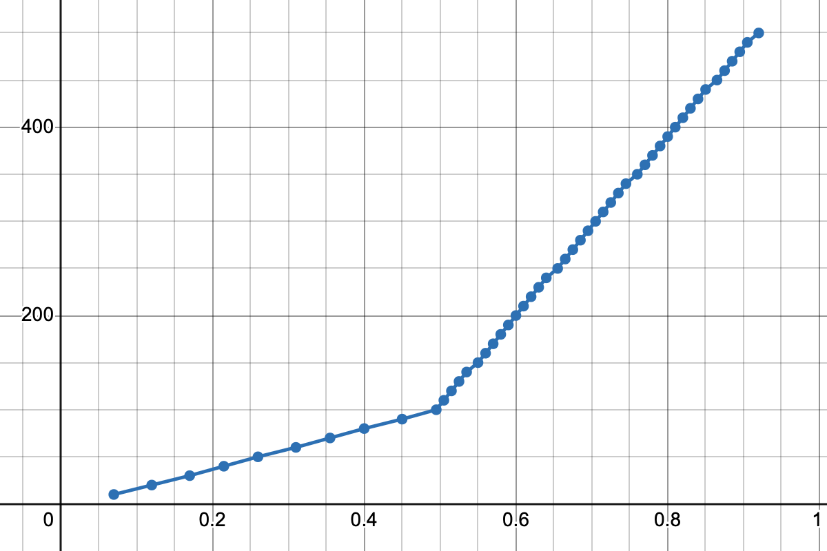
I’m not entirely sure whether this is an anticlimax. There aren’t any fancy Bézier curves in sight; instead, it’s just two line segments connecting the three key data points we mentioned earlier.
\[\begin{cases} y = 180x + 10 \;\;\;\:\;\text{(for \(0 \leq x \leq 0.5\))}\\ y = 800x - 300 \;\;\;\text{(for \(0.5 < x \leq 1\))} \end{cases}\]Justifying the two-line approach
As underwhelming as this result might be, it does raise an interesting question: why would one opt for the two-line approach as opposed to the exponential one proposed by so many Stack Overflow users?
To answer this question, I’ve made a slider that, like the one used in Microsoft Office, allows inputs from 10% to 500%, but whose outputs are computed in accordance with an exponential curve.
At first glance, this feels like a perfectly usable slider: it looks good, it works well, and it does the job. If one day Microsoft decides to pull a switcheroo and replaces their slider with this one, I probably wouldn’t even notice.
Nonetheless, there is still one major issue with this version, one that far outweighs all the advantages listed above — and it is thus: The underlying formula looks absolutely horrendous.
\[y = -\frac{500}{31} + \frac{810}{31} \cdot e^{2(3\ln{2} - 2\ln{3} + \ln{5})x}\]Sure, it’s a smooth curve that passes through all three key data points, but this doesn’t change the fact that the formula is an utterly gruesome mess filled with seemingly arbitrary numbers, which not only makes the source code less readable, but also hugely increases the risk of errors and typos. This is contrary to what we saw in the two-line approach, where the relationship between \(x\) and \(y\) can be simply described in code with an elegant pair of linear formulae, or perhaps with the help of a linear interpolation (LERP) formula.
Sometimes, a semi-linear slider might just be better than one that’s not linear whatsoever.